AERE
Branding Case Study
A Breath of fresh AERE
Drawing from the distinctive atmosphere and qualities the building will have, as well as its surroundings. Creating a space rooted in comfort and function while boasting sophistication and setting the stage for memorable experiences, and a breath of fresh aere…
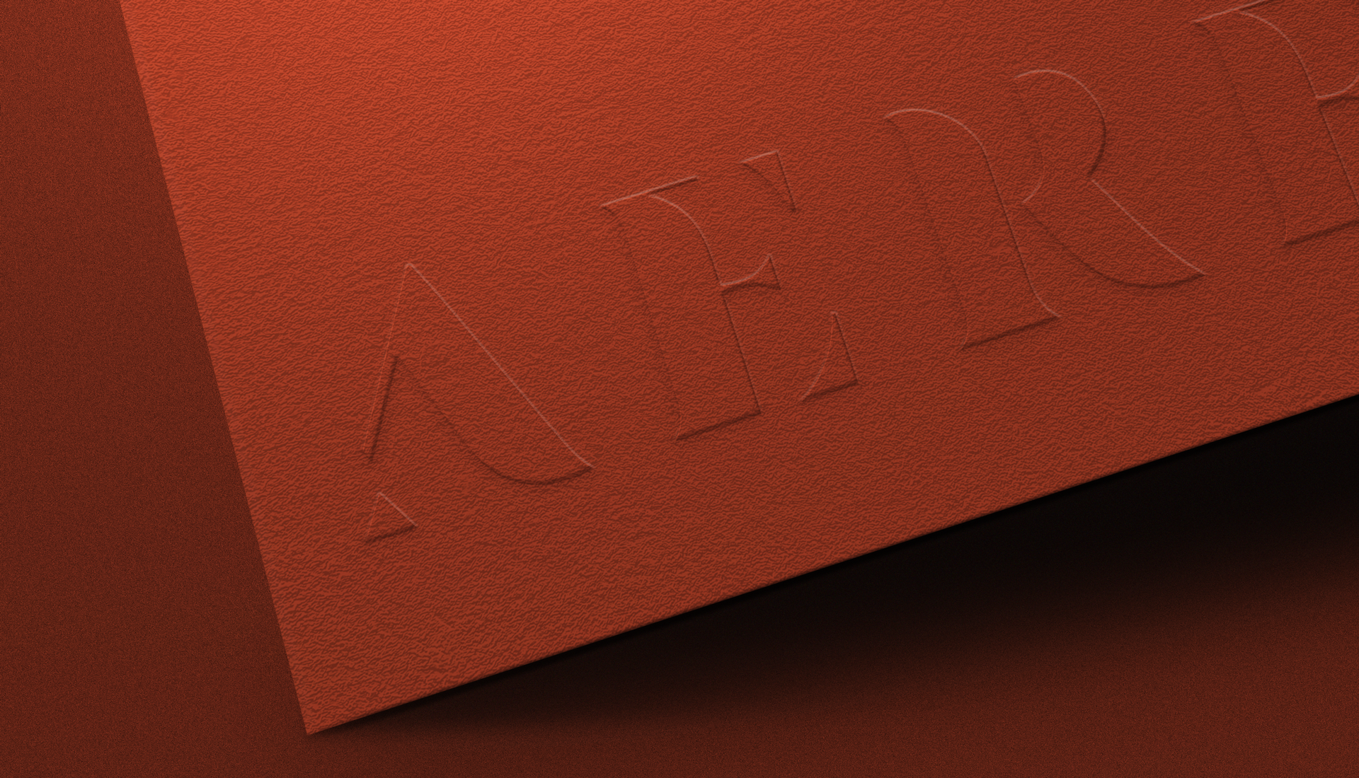
The AERE logo unveils a custom bespoke typeface designed to articulate the brand’s essence in a visually compelling manner. Each letter stands boldly, embodying strength and prominence, yet with a nuanced twist.
Within the letterforms, intentional negative spaces have been strategically woven. These apertures aren’t mere voids; instead, they embody a rhythmic dance, reflecting the subtle movement of air. The typography becomes a canvas where the invisible currents of air seamlessly traverse, breathing life into the design.
The deliberate incorporation of these dynamic elements mirrors the brand’s spirit – dynamic, vibrant, and constantly in motion. The AERE logo is a visual narrative, where the interplay of solid forms and ethereal spaces captures the brand’s identity in a strikingly distinctive manner.

Brand Identity Design:


